Painter guide
Choosing a Heritage Colour Scheme for an Inner West Brisbane Home
Choosing a Heritage Colour Scheme for an Inner West Brisbane Home
The short answer is: stick to the palette the house was built with, adjust for what you actually love, and check Brisbane City Council's guidelines before you commit to anything. A pre-war Queenslander or post-war character home in Ashgrove, Paddington or Red Hill already tells you a lot about where to start — the timber joinery, the original front door, the roof line all carry colour memory that modern palettes can fight against or complement.
That said, "heritage colour scheme" does not mean you are locked into pea green and mustard. It means you are working within a considered range of tones that were available to the original builders, or that read as sympathetic to the era. Getting that balance right takes some thinking. Here is how to approach it.
What Makes a Colour Scheme "Heritage" in This Context
Heritage colours are, broadly, pigment-based tones that pre-date synthetic bright paints. Think ochres, soft creams, muted greens, dusty reds, slate blues and deep charcoals. They tend to have more grey or brown in their base than their modern equivalents, which is what gives them that characteristic warmth rather than glare.
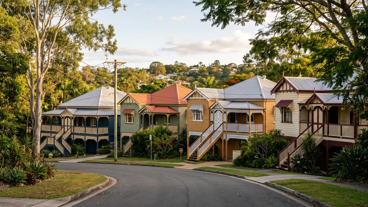
For Inner West Brisbane, the relevant era is typically Federation (roughly 1890-1915) through to post-war Queenslander (1920s-1950s). The architectural details change across that span — Federation homes lean toward deeper, more complex colour combinations with contrast on the joinery; later character homes were often painted simpler two-tone schemes. Knowing which decade your house is from helps narrow the palette considerably.
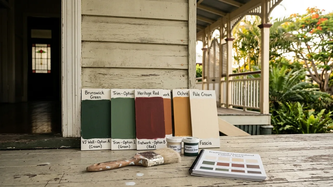
Most major paint brands (Dulux, Haymes, Taubmans) publish dedicated heritage ranges. Dulux's Heritage Collection and Haymes' Vintage range are the two we reference most often on jobs in Ashgrove and Bardon. They are not the only options, but they are consistent and widely available in the quantities you need for a full exterior repaint.
Brisbane City Council Rules and When They Apply
Brisbane City Council's Traditional Building Character (TBC) overlay covers a significant portion of Inner West Brisbane. If your property sits within this overlay, certain changes to the exterior — including colour — may require a development application or at minimum need to demonstrate character compliance.
In practice, painting an existing house the same or a similar colour rarely triggers a formal approval. Repainting in a dramatically different scheme, or painting a house that was previously unpainted (particularly unpainted timber), can attract more scrutiny. If you are unsure, the Council's online planning maps let you check your property's overlay status. It is worth spending ten minutes doing that before you fall in love with a particular colour.
Suburbs like Paddington, Red Hill and Ashgrove have relatively high concentrations of TBC-overlay properties. Toowong and Auchenflower have a mix. The Gap is generally less affected, but individual streets vary.
We always recommend checking your overlay before finalising a colour, and we are happy to flag this during a quote if you have not looked into it.
The Three-Colour Structure Most Queenslanders Use
A well-resolved exterior colour scheme for a Queenslander or Federation home typically works across three roles: the body, the trim, and the accent.
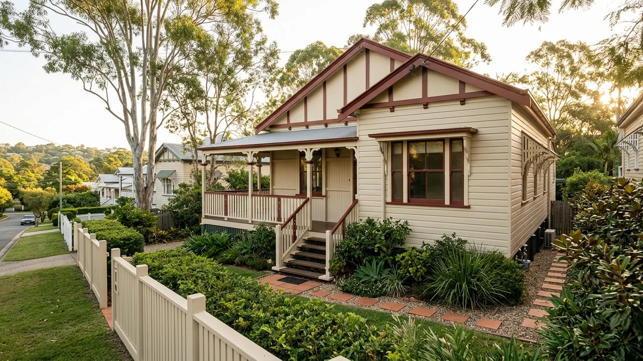
Body — the largest surface area, usually the weatherboards or cladding. This is where you make the biggest statement. Lighter body colours tend to read as more traditional and also help with heat load in Brisbane summers, which is a practical consideration worth weighing.
Trim — the fascias, bargeboards, window surrounds and sometimes the stumps. Trim is almost always a lighter version of the body or a crisp off-white/cream. Bright white trim is a modern preference that can look sharp but sometimes flattens the character of older timber detailing.
Accent — the front door, shutters, veranda brackets and decorative fretwork if present. This is where you have the most freedom. A deeper version of the body colour, a contrasting tone, or a period-appropriate feature colour all work. Deep red, bottle green, and dark slate blue are all defensible accent choices on a Federation or early Queenslander home.
The ratio matters as much as the colours themselves. A strong accent that eats too much visual space (say, painted veranda posts) can overwhelm a careful body-trim combination. As a rule of thumb, accent areas should be genuinely secondary in surface area.
Practical Considerations Specific to Inner West Brisbane
The Inner West has some particular conditions that affect how paint performs and how colours look in situ.
Light. Brisbane's subtropical light is intense and direct. Colours look significantly different here than on a manufacturer's chart printed for southern states. A tone that reads as warm grey in Melbourne can look almost beige under Ashgrove sun at midday. Always test in full Queensland sun, not just in shade or indoors.
Timber. Most pre-war homes in this cluster are chamferboard or VJ (vertical joint) hardwood. Hardwood moves more than softwood, and it holds colour differently. A good oil-based primer locks in the colour base better than water-based on weathered hardwood — this matters for the final appearance as much as it does for longevity.
Vegetation. Jacaranda and poinciana are common street trees in Paddington, Bardon and Red Hill. They drop. Lighter body colours and horizontal surfaces (fascias, window sills) show the staining more readily. This is not a reason to go dark, but it is worth thinking about maintenance cycles.
Salt air. For homes in Toowong and Auchenflower near the river, mild salt content in humid air can affect some paint types over time. For coastal-adjacent Inner West suburbs this is less significant than, say, Wynnum, but it still informs primer and topcoat selection on exposed faces.
DIY Colour Testing vs. Consulting a Painter or Colour Consultant
You can absolutely test heritage colours yourself. Buy sample pots (typically $10-$15 each), paint A4-sized patches on the actual timber in at least two different spots on the house, and observe them over two to three days at different times. This costs almost nothing and prevents expensive regret.
Where a colour consultant adds genuine value is in reading the undertones — the hidden warm or cool cast in a colour that your eye adjusts to and stops noticing on a small chip. Good consultants also understand how multiple colours interact on a facade, which is harder to judge from sample pots alone. A session typically runs $150-$400 depending on scope. For a full exterior repaint that might cost $6,000-$9,000, that is reasonable insurance.
We do not offer formal colour consultancy ourselves, but we can share what has worked well on similar homes in the area and we will tell you honestly if a proposed combination is going to look awkward once it is up.
Putting It Together: A Practical Starting Point
If you are standing in front of a 1920s chamferboard Queenslander in Ashgrove wondering where to begin, here is a sequence that works:
- Identify the era as closely as you can — Federation detailing versus later character versus interwar simple style. This tells you which direction of complexity is appropriate.
- Check the overlay on Council's planning maps so you know your constraints.
- Look at neighbouring homes on the same street, not to copy, but to understand what the street reads as. A scheme that is harmonious but distinct is almost always better than one that clashes with or perfectly mimics the neighbours.
- Test at least three combinations as painted patches on the actual house. Include one that feels too conservative and one that feels slightly brave.
- Decide on sheen — low sheen or flat for body, semi-gloss for trim, is the most common combination on heritage homes. High gloss on body reads as modern.
The best heritage colour schemes we see on finished jobs in this part of Brisbane share one quality: they look like they have always been there. That is not an accident. It comes from working with the house, not against it.
If you want a second opinion on a combination you are considering, or a quote for the repaint itself, we cover Ashgrove, Paddington, Bardon, Red Hill and the surrounding suburbs. We are used to working on character homes and we know what the houses in these streets typically respond to.
Quick answers